
Food & HospitalitySydney, Australia

Lala’s Burgers

A complete rebrand built for a broader Sydney audience — bold, recognisable and easier to read.

Brand IdentityPackagingWebSignage

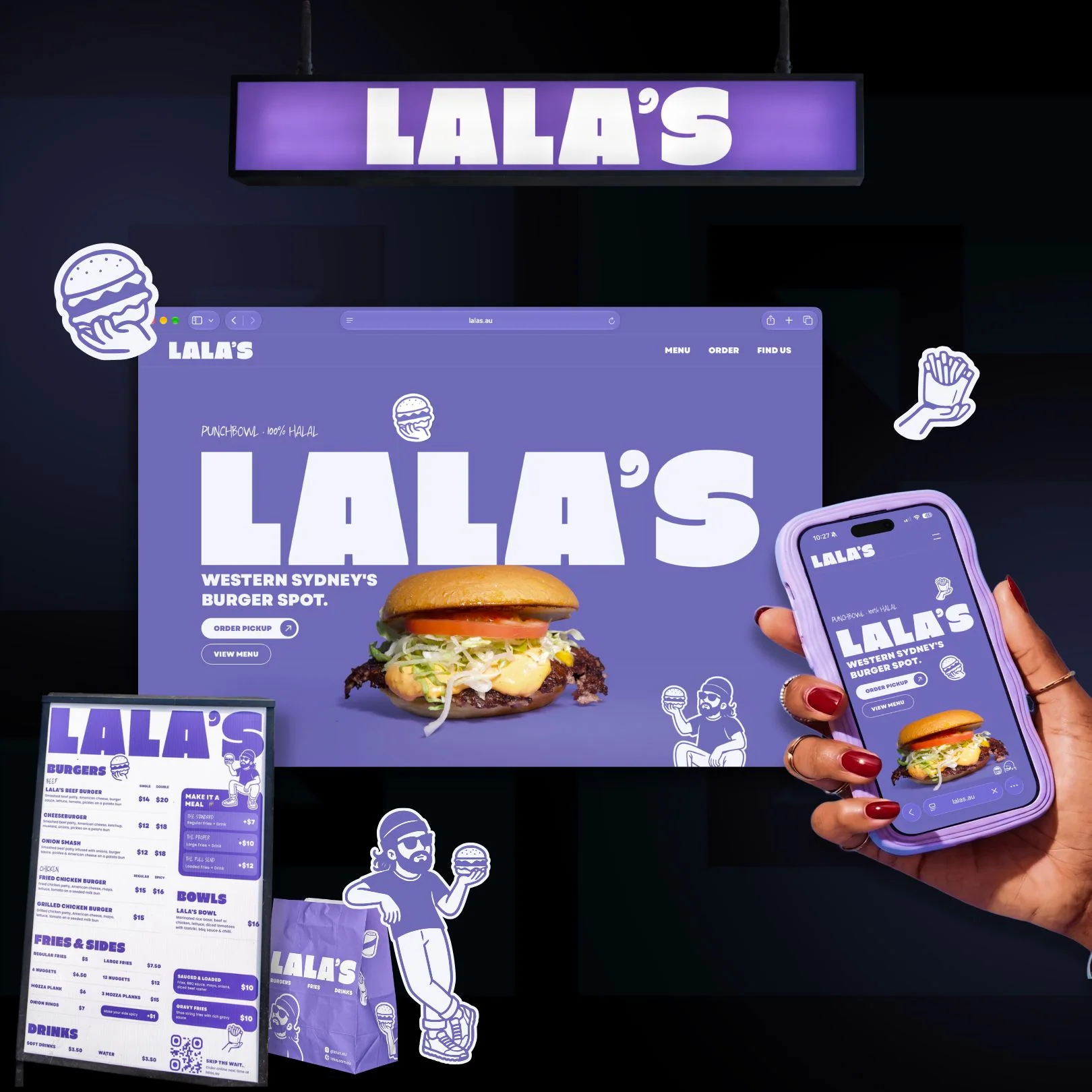
A complete brand system designed to carry Lala’s into its next chapter, bringing a clearer identity to every menu, package, sign and screen.
The Vision

The Vision

Lala’s had outgrown its original branding. The owner wanted to welcome a broader Sydney audience while keeping the personality and local roots that made the business its own.

Lala’s had outgrown its original branding. The owner wanted to welcome a broader Sydney audience while keeping the personality and local roots that made the business its own.

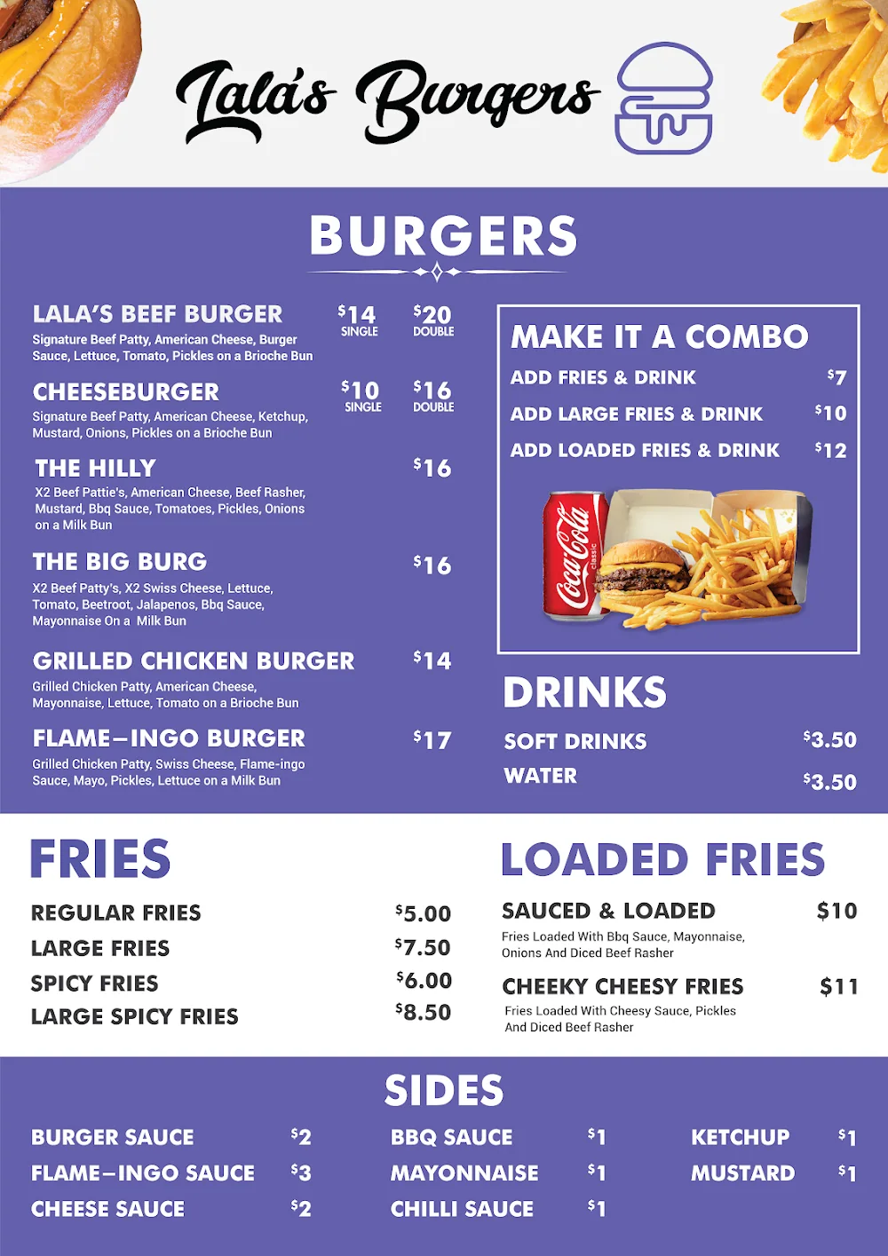
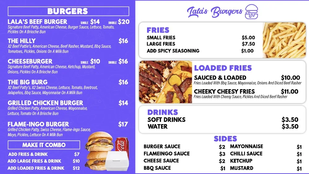
Original Lala’s branding

The goal was a clearer, more recognisable identity, with the broader appeal of neighbouring business Street Kid as a reference.

The goal was a clearer, more recognisable identity, with the broader appeal of neighbouring business Street Kid as a reference.

The goal was a clearer, more recognisable identity, with the broader appeal of neighbouring business Street Kid as a reference.

The objectives were clear:

The objectives were clear:

Create a brand with appeal beyond its immediate neighbourhood

Create a brand with appeal beyond its immediate neighbourhood

Make the name and typography easier to read from a distance

Make the name and typography easier to read from a distance

Build a distinctive system of logos, mascots and illustrations

Build a distinctive system of logos, mascots and illustrations

Unify packaging, menus, signage and the website

Unify packaging, menus, signage and the website

Keep the character and local roots that customers recognise

Keep the character and local roots that customers recognise

One clear identity, from the shopfront to the screen.

One clear identity.

From the shopfront to the screen.

The Challenge

The Challenge

The original identity needed to overcome a few clear challenges:

The original identity needed to overcome a few clear challenges:

A visual identity strongly tied to its immediate neighbourhood

A visual identity strongly tied to its immediate neighbourhood

A script wordmark that was harder to read from a distance

A script wordmark that was harder to read from a distance

Busy menus that needed a clearer visual hierarchy

Busy menus that needed a clearer visual hierarchy

Packaging and signage that needed a consistent identity

Packaging and signage that needed a consistent identity

A wider Sydney audience to welcome without losing local character

A wider Sydney audience to welcome without losing local character

A complete rebrand to carry across physical and digital touchpoints

A complete rebrand to carry across physical and digital touchpoints

The challenge was to broaden the brand’s appeal and improve legibility without losing the energy and character of Lala’s.

Behind the Identity

From the original shopfront to a canvas of possibilities. Exploring the wordmark, characters, menus and packaging together helped the identity take shape as one system.
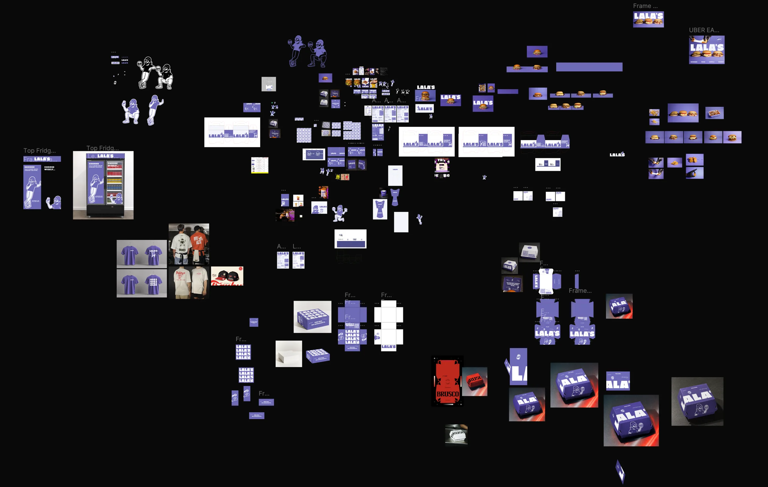
Full Lala’s Figma working canvas showing mascot studies, menus, packaging dielines and brand applications
Inside the working fileThe explorations behind the finished identity. Tap to explore the full canvas.

The Finished Brand Guidelines

The explorations brought together into a consistent system for typography, colour and brand applications.

From Canvas to Brand

Three working sessions, condensed into a closer look at the craft.

Drawing the characterRefining the mascot in Figma.
Building the menuShaping the typography and menu layout.
Taking it onlineBuilding the website in Framer.

Before & After

The transformation, from the menu to the shopfront.
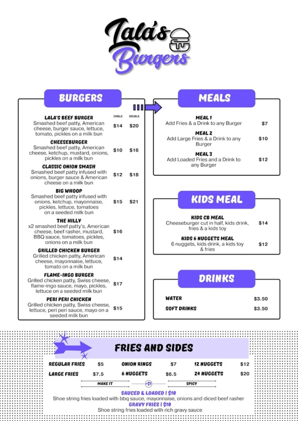
The Menu

Original Lala’s menu with script logo and boxed menu categories
BEFOREThe original menu
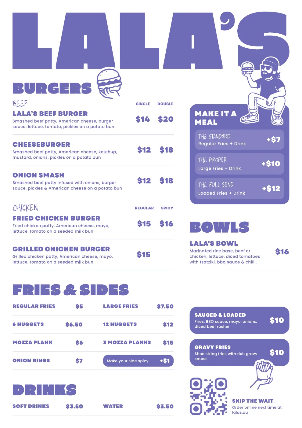
Finished Lala’s menu with bold headings, mascot illustrations and purple brand colours
AFTERThe finished menu

The Storefront

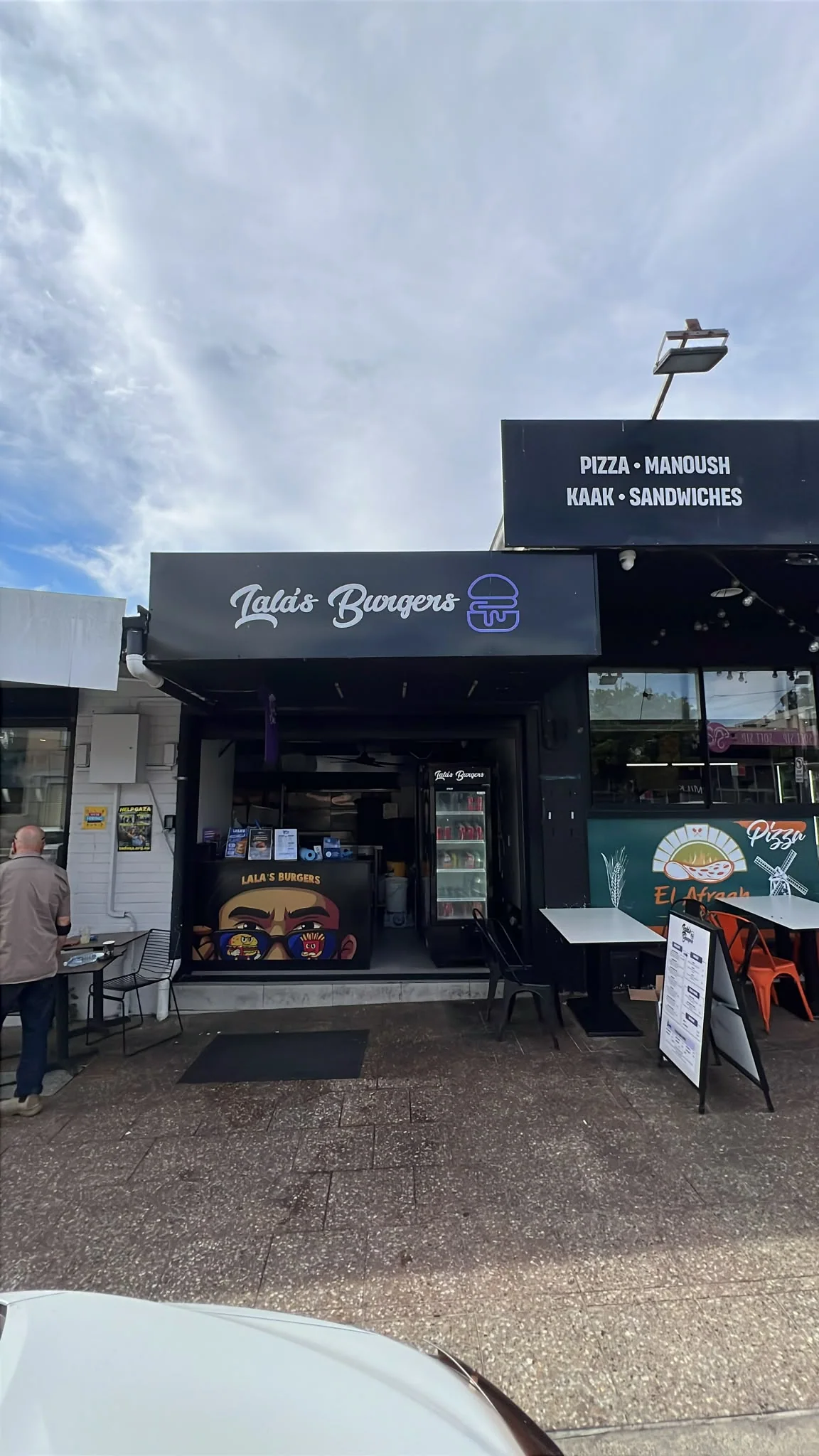
Original Lala’s storefront, framed around the sign and service counter
BEFOREThe original shopfront
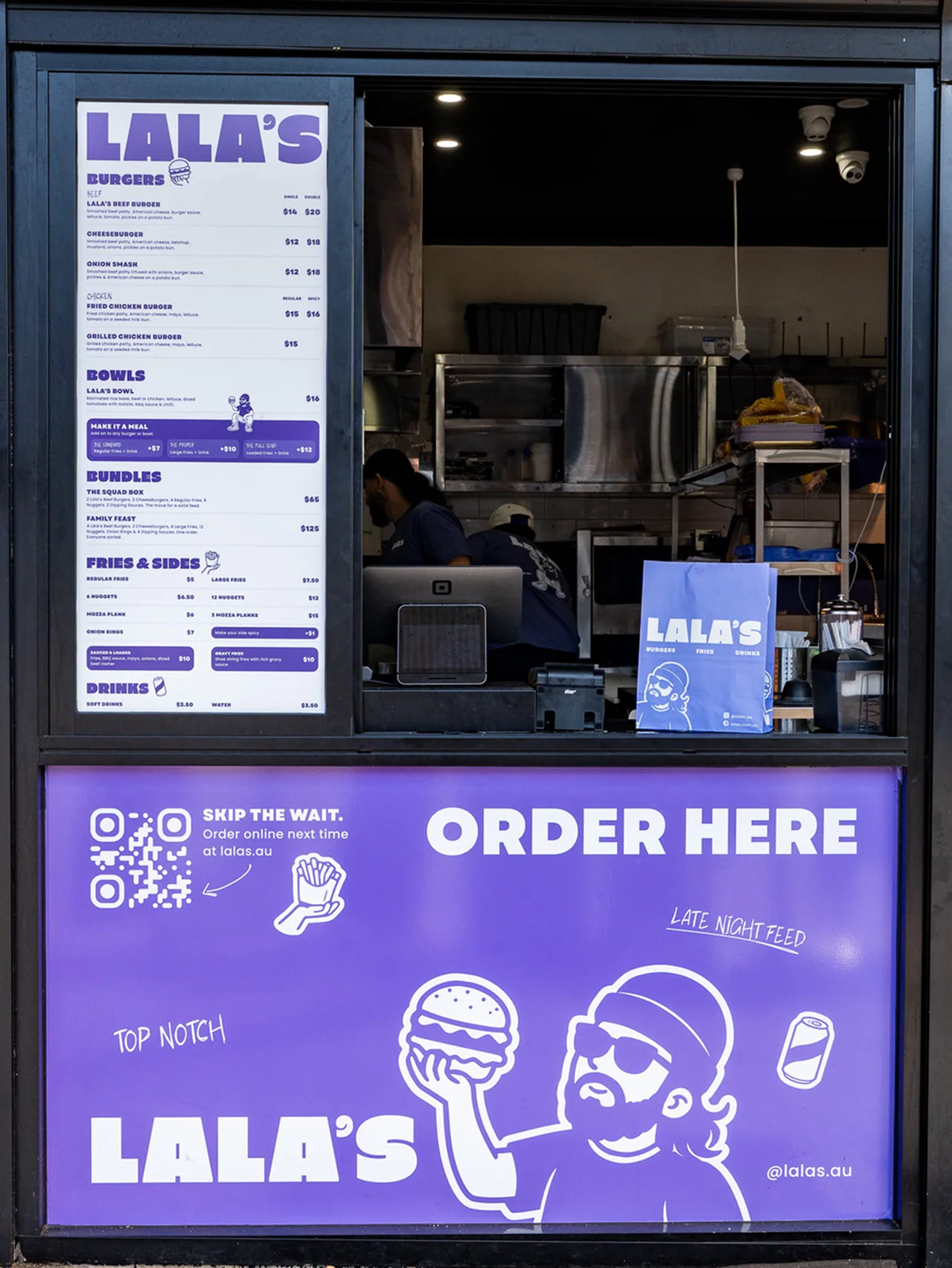
Rebranded Lala’s storefront with new menu, purple counter signage and illustrated packaging
AFTEROne identity across the counter

Brand Identity System

A bold wordmark gives the name more presence. Purple connects the system, while expressive mascots and food illustrations bring personality to the functional pieces.
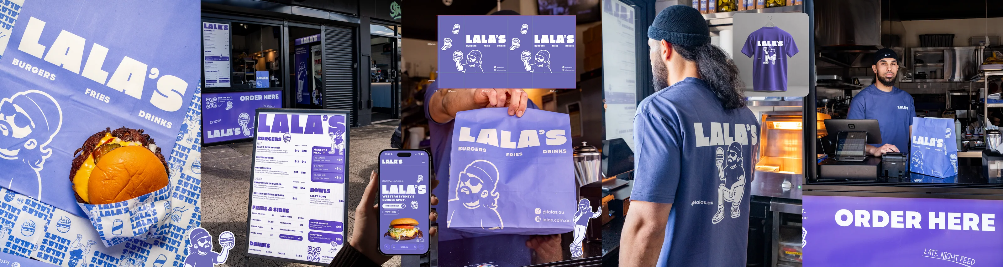
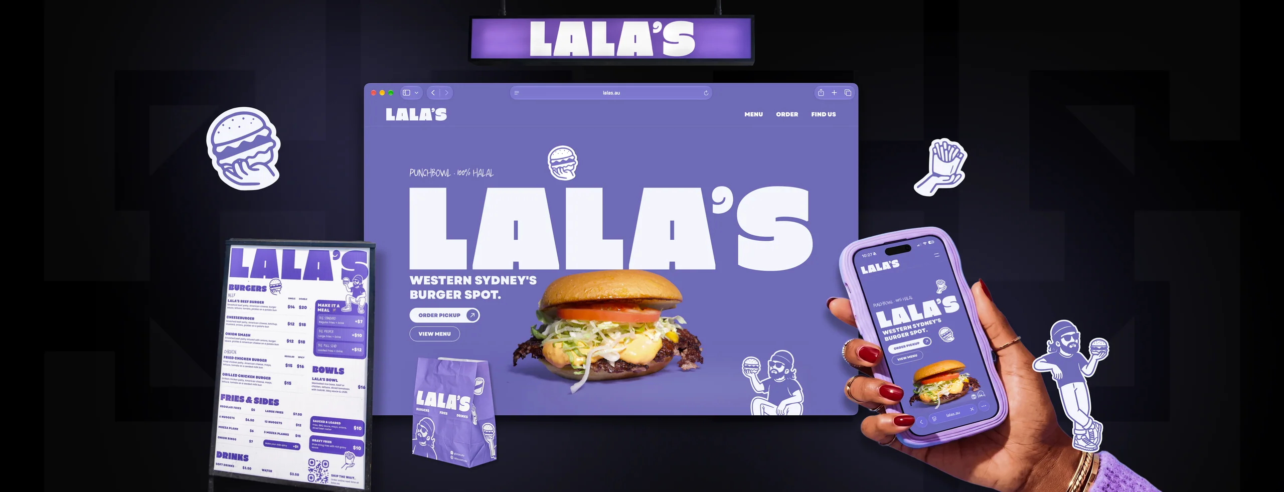
Lala’s rebrand across storefront, packaging, uniforms and menus

From the Counter to the Street

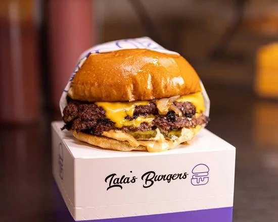
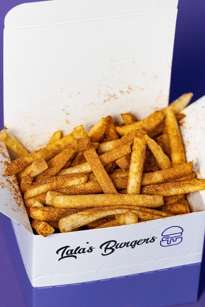
Burger boxes, paper bags, wrapping paper, menus, signage and uniforms carry the same visual language. Each piece belongs to one recognisable brand.
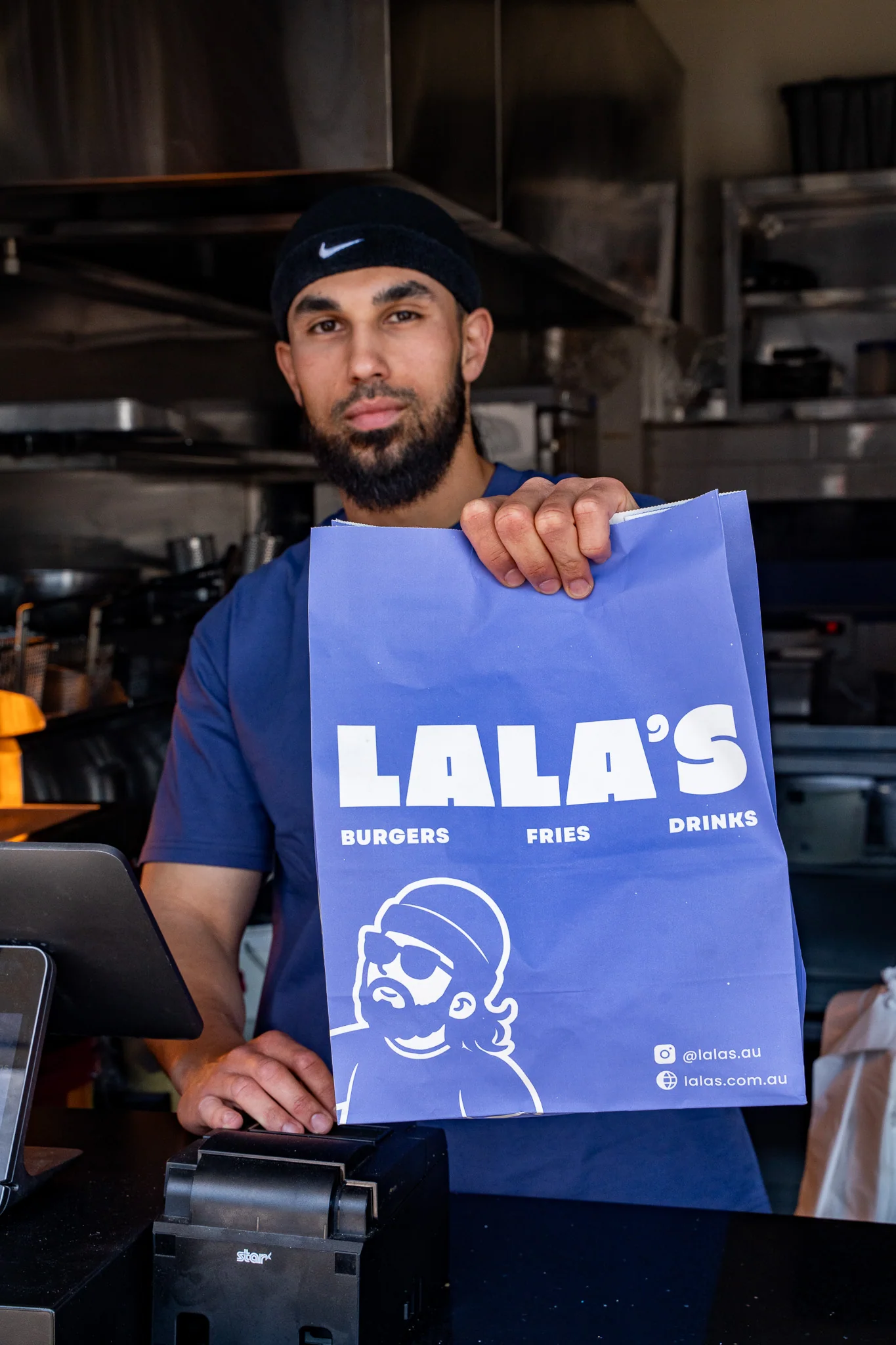
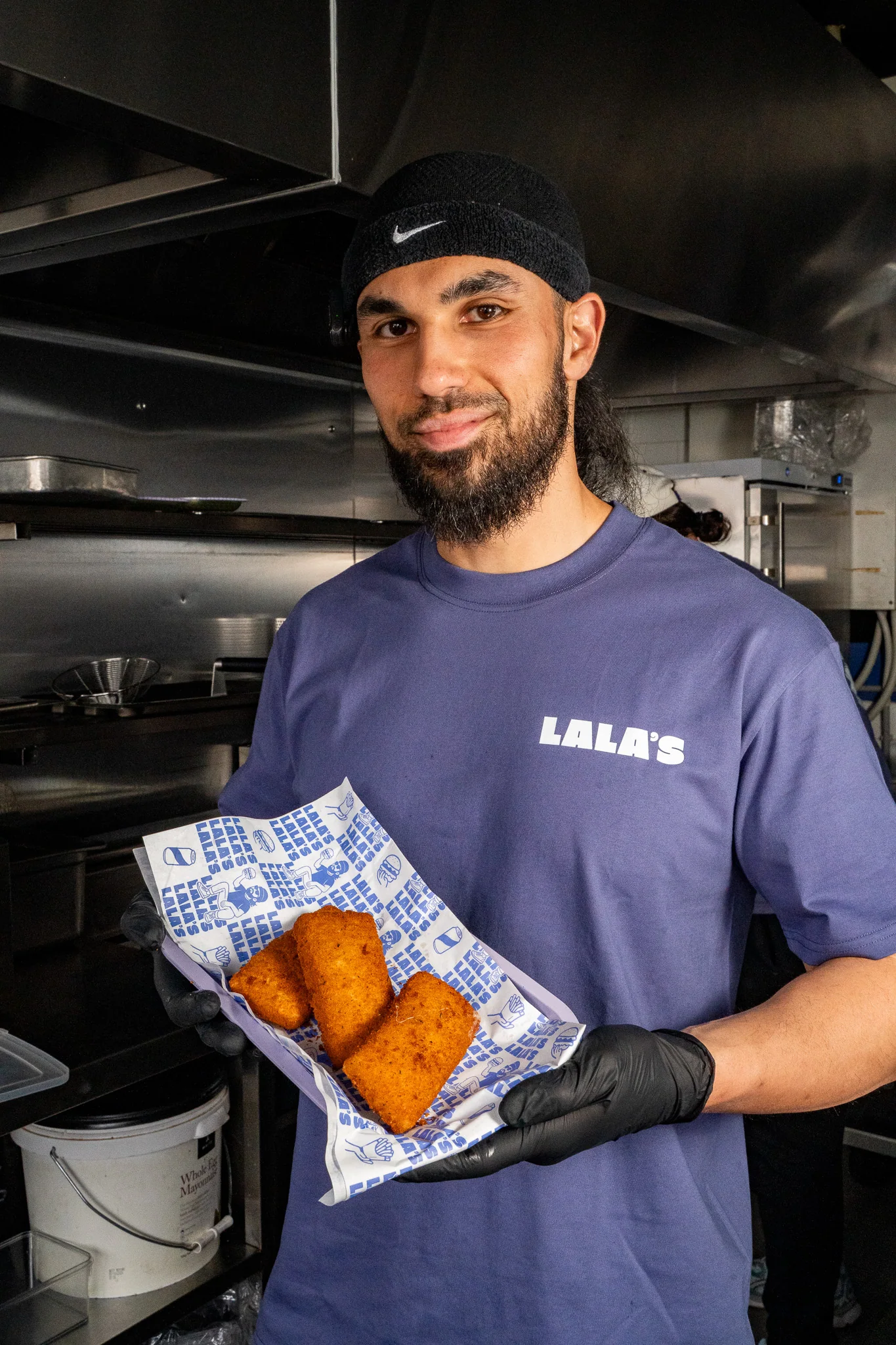
New Lala’s illustrated takeaway bagLala’s uniform and branded wrapping paperLala’s wordmark on staff apparel

The Brand, Online

The website extends the identity into a mobile-first experience, with the menu, pickup ordering and location easy to find.

One Identity, Everywhere

The transformation is visible across the business: a bolder name, a clearer hierarchy and a consistent identity from the first impression to the takeaway bag.


YOU DID
THE HARD PART.

Let’s make sure people see it.

You’ve built the business, the reputation and the results. Let’s talk about a brand, website and sales system that reflect them.

Book a Discovery Call

A free, 15-minute conversation about your business and what comes next. Choose a time below.

Calendar not loading? Book directly on Cal.com

Start your project